The Shade Room
The Shade Room was the first project that I was in charge of the User Interface. Along with a very helpful group to collaborate on this application,
I did research on the functionality of my design. During this time period I got into a car accident which caused a setback on my projection and
knowledge obtained. The Shade Room's main focus was to develop an Android Studio mobile application that would challenge the user to identify the
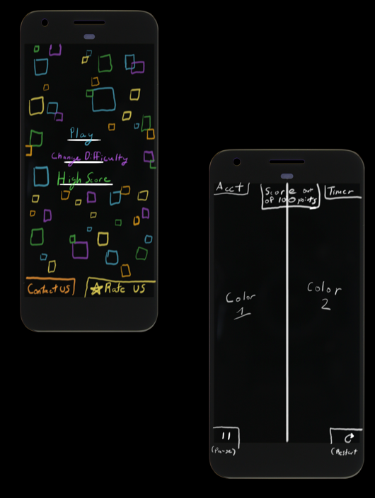
square containing the darkest shade of the color provided. Initially, the actual gameplay area was a simple constraint construction which turned out to
be the best part of that I designed.
This application sparked my interest in User Interface and front-end development. When I fell short in performance, designing pages that I and the client felt were
subpart to the actual game concept, I decided that I would shift my focus in career to User Interface. This project was a learning experience and I wanted
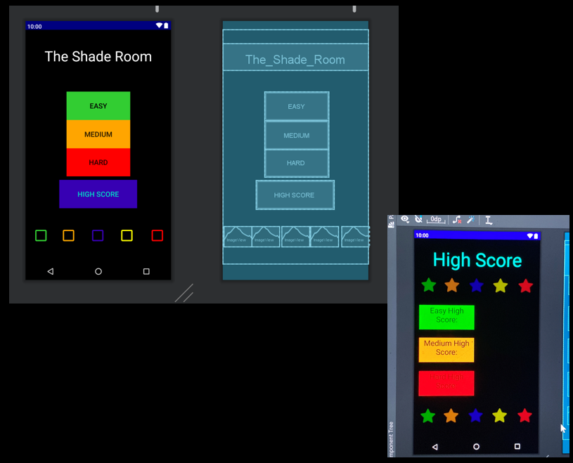
to improve on this weakness because of my interested in the field. The color scheme was not the best giving the harsh hexadecimal color codes I chose. Along with
this in the Home Screen and the High Score screen the vectors are not up to standard for a functioning Android application. Although this app worked and ran smoothly
the importance of collaborationm, communication, and creativity. As you can see from the images of the screens, the design needed a lot of improvement. The colors and
vectors are harsh. Along with this I did not get to complete the animation of the squares at the bottom of the Home Screen. These squares were intended to be moving
around bouncing off the screens boundaries constantly.
Below are images of the Home Screen and High Score screen I designed along with gameplay of The Shade Room.


This is a video demonstration of the "Easy" game mode for The Shade Room.
This is a video demonstration of the "Medium" game mode for The Shade Room.
This is a video demonstration of the "Hard" game mode for The Shade Room.